Using ARDI Data in Excel
For our first exercise, we'll bring some ARDI data into Excel.
Our Task
In this case, we want to create a bar-chart showing the average amount of power each of our wind turbines has generated over the last hour.
Step 1: Identify the Assets & Build a Query
There are many different ways to build a query for the information we're looking for. You can dive into the process and options here.
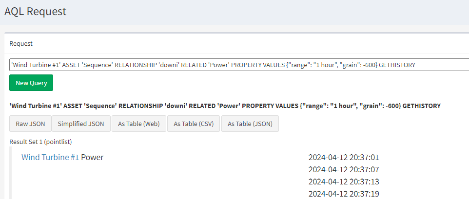
'Wind Turbine #1' ASSET 'Sequence' RELATIONSHIP 'downi' RELATED 'Power' PROPERTY VALUES {"range": "1 hour", "grain": -600} GETHISTORY
Step 2: Write The Query Interactively
Go to https://demo.optrix.com.au/s/ex/aql/show and copy-and-paste the query above.
Right-click the As Table (CSV) button and choose Copy Link.
Step 3: Open Excel PowerQuery
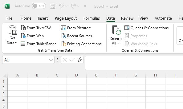
Open an Excel document and select the cell where you'd like to create your table of ARDI data.
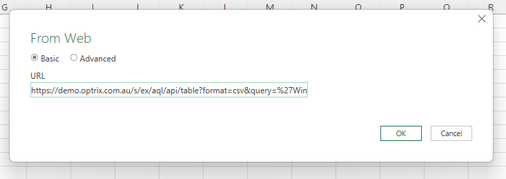
In the Data ribbon, press From Web (or find it under the Get Data section).
Paste in the URL you copied in step 2.
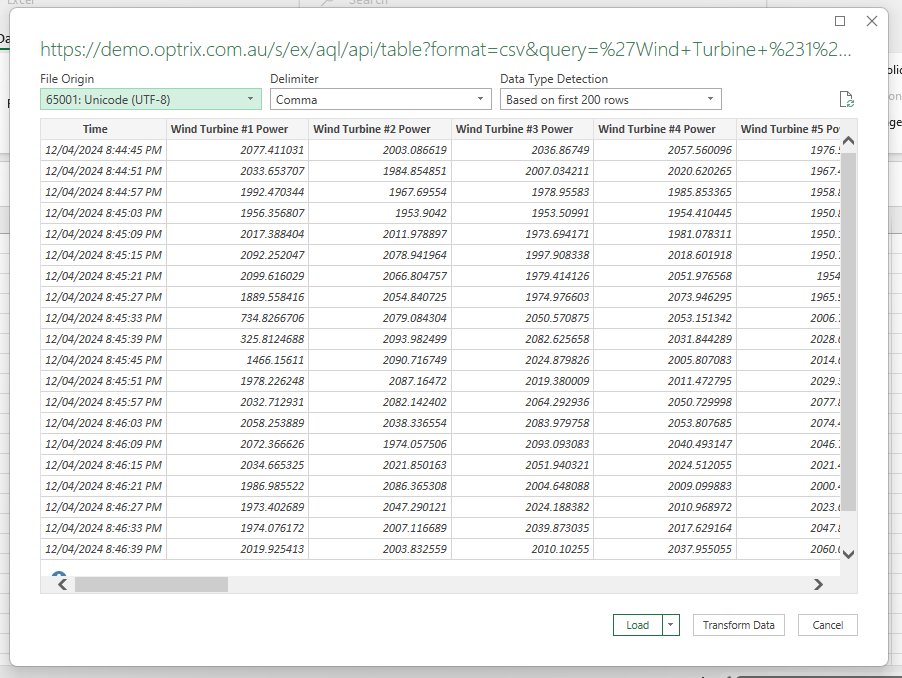
Press Load to confirm the table of data, and your information will be loaded directly into Excel.
Interesting Facts
Some interesting things about this new spreadsheet is how adaptable it is.
Because we used a relative time range, the user can refresh their data at any time for up-to-date results.
Because we used a dynamic query, the results will dynamically update if the wind farm adds any more assets, and those new assets will be shown in the correct order.
And because we're using ARDI generally, we can take our finished Excel file and re-use it on other wind-farms, even if they have radically different behind-the-scenes infrastructure.


