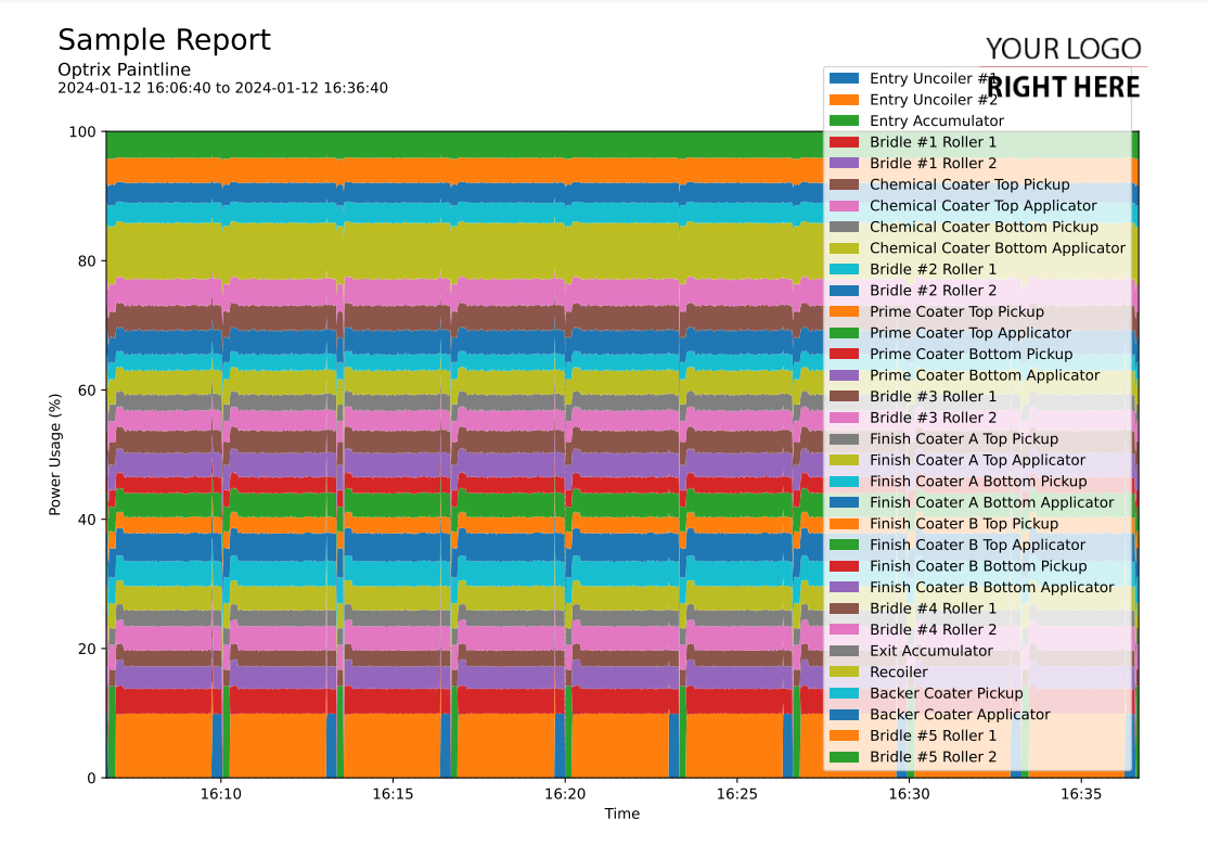
Normalised Stacked Area Chart
This code sample of a area chart report.
This creates a stacked area chart of all of your assets with a particular property.
Rather than showing the raw value, it shows what percentage of the total was found in each of your assets (ie. how much power being consumed or generated).
Customising
| Element | Replace With |
|---|---|
| [PROPERTY] | The name of the property you want to report on |
| [MEASUREMENT] | The name of the measurement (ie. Temperature) |
| [UNIT] | The units the measurement is in |
The Code
import os
import sys

sys.path.insert(0,os.path.dirname(os.path.dirname(__file__)))

import mplreport
import datetime

@mplreport.ardireport("Sample Report")
def CreateReport(report,args):

    #Create a page containing a single plot.
    fig,ax = report.CreatePage(1)

    #Print a title block for the page.
    report.Title()

    #Our AQL query goes here
    query = "('[PROPERTY]') PROPERTY ALLPOINTS"

    #Get the pandas data-frame with the results.
    df = report.GetHistory(query)

    #Calculate the total amount for each time index...
    totals = [0] * len(df.index)

    #What's the total at each index?
    counter = -1
    for indx,rw in df.iterrows():
        counter += 1
        for col in df.columns:
            totals[counter] += rw[col]

    #The cumulative totals so far, so we can draw the next area above the previous one.
    sofar = [0] * len(df.index)

    #Draw the area chart
    for col in df.columns:
        values = ((df[col] / totals) * 100) + sofar
        ax.fill_between(df.index,sofar,values,label=col.replace(" [PROPERTY]",""))
        sofar = values

    #Set the minimum Y value to 0
    ax.set_ylim(0,100)

    #Clean up and prettify
    ax.margins(x=0)
    ax.set_xlabel("Time")
    ax.set_ylabel("[MEASUREMENT] ([UNIT])")
    ax.legend(loc='lower right')

    report.TimeAxis(ax.xaxis)
    report.Grid(ax)

    #Save this report out.
    report.Save()
