
Overall
Heatmaps are ideal when you have a set of assets and you’d like to look at a particular value across each of them, over time.
They are a great alternative to line graphs when you have a large number of values to view. While line-graphs become difficult to read with as few as five channels, heatmaps allow for almost any number of channels, although are less exact.
Example
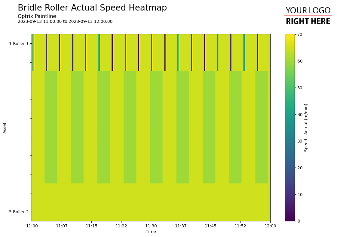
This example shows a heatmap of how fast each of our machines are running.
From the map, you can see that…
- The first two items are regularly stopping dead, but only for a short amount of time.
- The middle assets tend to go fast, then go slow in a constant pattern. They all change speed at the same time.
- The last two run constantly with no change in speed.
In practise, heatmaps are often a great way to view large amounts of data to spot potential problems.
You can find this example on our paint line demo site.
- They work best if there’s an underlying order to the assets you want to view – for example, going from Pump #1 to Pump #10, or from the start of the production line to the finish. This helps make your heatmap more understandable to your readers.
See Others
Heatmap visualisationsReport visualisations