
Overall
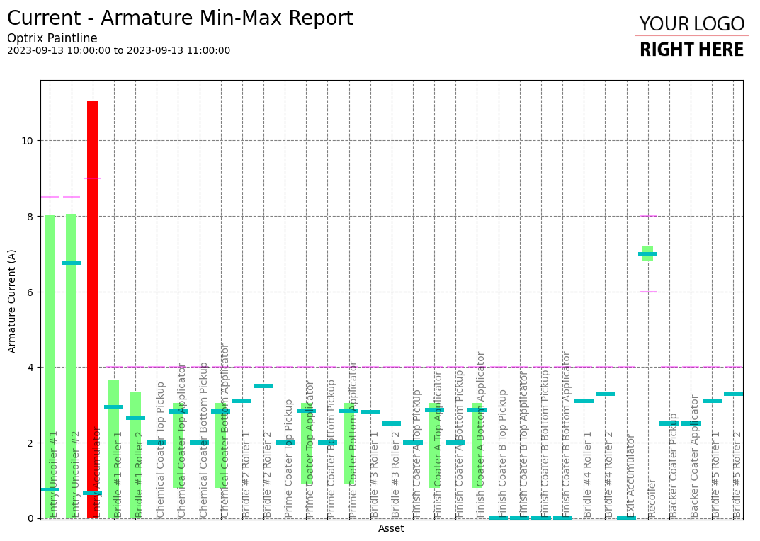
These reports are used to find the minimum, maximum and average values of a particular property across a set of different assets.
This can be an easy way to spot unusual activity on your site – sudden changes on an individual asset from day-to-day can indicate issues that need further investigation.
Example
You can find this example on our paint line demo site.
Tips and Tricks
This is an example of adding context to a report by including enough details to let your people understand if the values are good, or bad.
Compared to this report without the limits, we can see how adding the upper and lower thresholds allow readers to see if assets are performing correctly at-a-glance.
See Others
Bar visualisationsReport visualisations
Summary visualisations
Vertical visualisations