
Overall
Six-Sigma reports are used to check for possible issues with the control of a process.
Although often used in slower business processes, six-sigma charts can indicate problems when used at a medium time frame (for example, over 24 hours) in process data.
Example
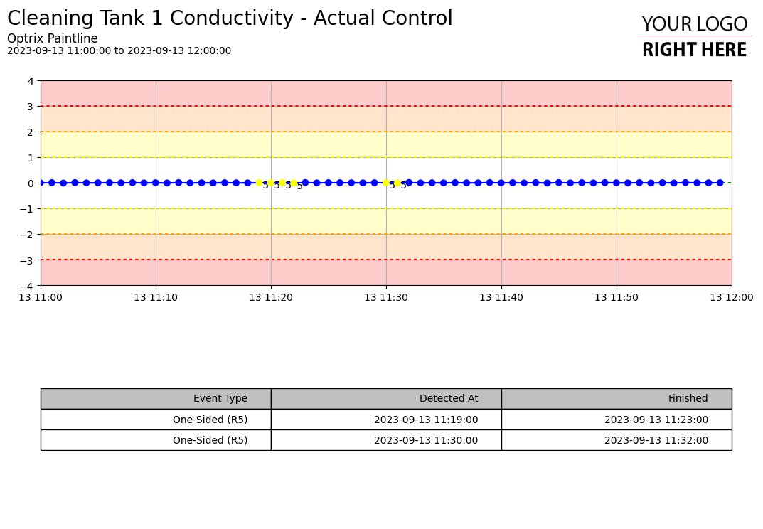
This example shows a six-sigma chart illustrating how well the conductivity is being controlled in our system.
The list at the bottom of the report indicates a possible Six-Sigma issue – for several samples in a row, the conductivity was slightly below the target. Although the issue was only slight, it being repeatedly under may indicate a control loop that is needs review.
Although this style of report has maximum value if you have people trained in six-sigma in your organisation, it can still be useful to the untrained eye thanks to its automated analysis.
You can find this example on our paint line demo site.
- Six-sigma charts are deliberately low-resolution, as sensor noise can cause significant issues. Depending on your process, you might need to tune the duration of your report to best capture issues. Too short a time-frame may give many false positives, while too long a timeframe may reduce the level of visible detail too far for issues to be detected.
See Others
Analytic visualisationsControl visualisations
Line visualisations
Report visualisations
Table visualisations