Overall
Some processes are cyclic – they constantly come back to where they started before they begin again.
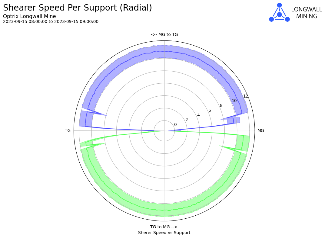
In some cases, it can be difficult to help the reader understand the nature of the cycle from a traditional chart. This is where radial charts can be very useful.
Although they aren’t as easy to read as normal linear charts, it can be useful when you want to help your audience understand that the line never actually ends – it just goes back to the beginning.
Example
In this example, we are looking at the average, minimum and maximum speed for our shearer (the machine that cuts through rock and coal in a longwall mine) as it passes along the mine-face.
The shearer moves from one end – called the Maingate (shown as MG), to the Tailgate (shown as TG), and then back again.
From the chart, we can see that speeds are quite consistent across most of its travel, except for either end (as expected – you can’t go full-speed into a dead end). But it’s a little slow getting started when started cutting from the MG to the TG.
This report can be found in our longwall demo site.
See Others
Area visualisationsLine visualisations
Report visualisations