Overall
A bar-chart is a very simple and effective way to compare points of data, either against one-another, or over time.
Although line charts and area charts can also convey the same information, bar-charts can be useful when one of your chart axes represent distinct objects rather than a continuous number, since it allows the user to more clearly read where any drops or spikes happen.
Example
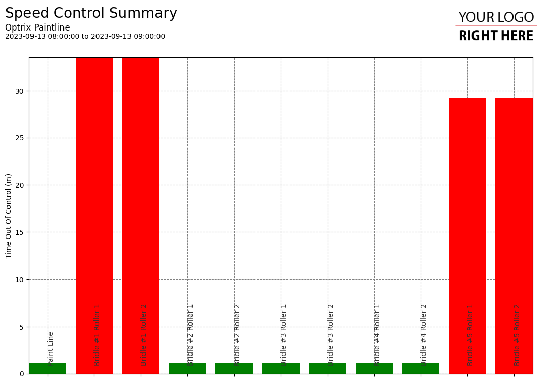
In this case, we are looking at how much time our moving assets have been spending outside their target speed. We can quickly see that Bridle #1 and Bridle #5 are out of control much more often than the other assets.
You can find the example report on our paint line demo.
Tips and Tricks
- If using asset names on one of your axes, consider bringing the axis labels inside your report. This allows for very long asset names, without shrinking your axes to fit the page/paper.
- Always consider using colour to convey useful information. Here, we’re colouring bars to indicate if the values are considered acceptable (green), questionable (yellow) or bad (red).
Similar
2D live bar-chart infographics
3D live bar-chart infographics
See Others
Analytic visualisationsBar visualisations
Control visualisations
Report visualisations
Summary visualisations
Vertical visualisations