Overall
A bar-chart is a very simple and effective way to compare points of data, either against one-another, or over time.
Although line charts and area charts can also convey the same information, bar-charts can be useful when one of your chart axes represent distinct objects rather than a continuous number, since it allows the user to more clearly read where any drops or spikes happen.
Example
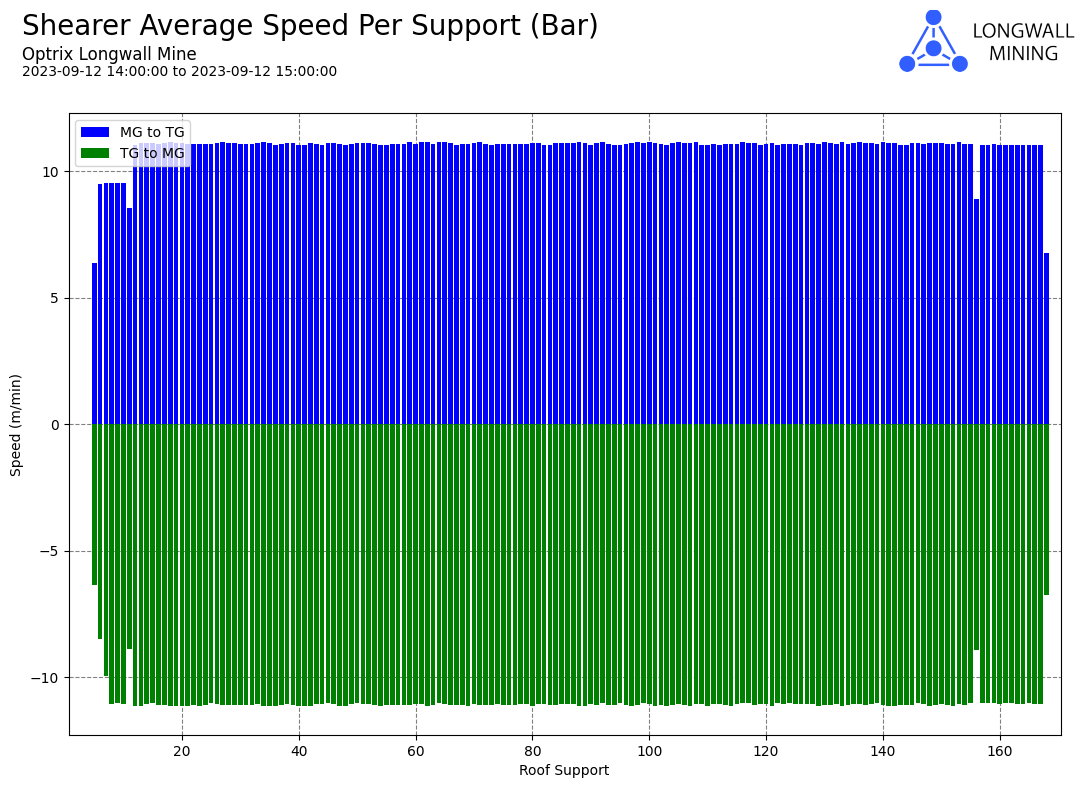
In this case, the chart is tracking an object that moves up and down a track. The report extracts the speed of the object as it passes other assets along the track.
It’s useful for our users to see the difference between the speed of the machine when it’s moving left-to-right (the blue bars) compared to when it’s moving right-to-left (the green bars).
See Also
This same data is also used in our example of radial and cyclic reports.
See Others
Bar visualisationsDirectional visualisations
Report visualisations
Vertical visualisations