Overall
We’ve extended our initial experiments using Large Language Models (such as ChatGPT/Claude/Gemini) to let the models create visualisations.
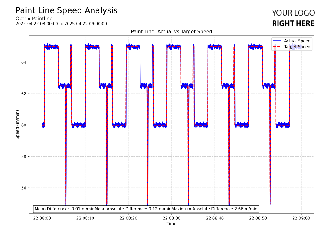
The example shown was generated with the prompt “Create a Python report comparing the actual speed vs the target speed on the Paint Line.“.
The output was a Python script that used the ARDI reporting library to create a report showing the actual vs the target speeds, which could then be used in our reporting system and deployed.
This report can be found in our paint line demo.
Interesting Notes
There are several interesting results.
When asked to simply show results, we were given a single page and analytics such as min, max and average values.
But when asked to compare results, we were given a two-page report that showed divergence and min/max differences.
The report was appropriately named and formatted, with target speeds given dashed lines so they are visually distinct from the actual values.
See Others
Ai visualisationsLine visualisations
Report visualisations