Overall
Showing discrete values over large periods of time can be challenging.
Although horizontal bar charts like the horizontal bar report, work well for shorter periods of time, they begin to have problems when used over larger time-frames.
An outage that lasts 30-seconds will be easy to spot on a report covering 10 minutes, but will be completely invisible when reporting over a month.
A discrete average area report allows you understand how the distribution of discrete values have changed over time. The time axis has reduced resolution to try and balance the ability to see state vs time.
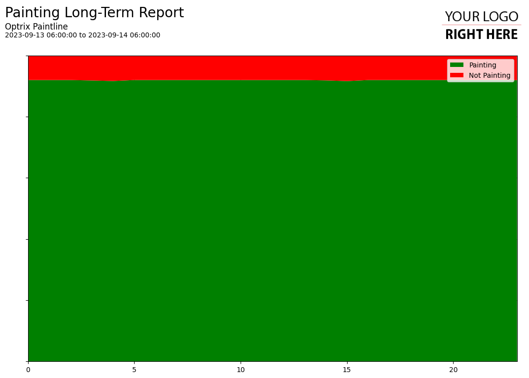
Example
This example shows the amount of time the system has been painting, vs not painting.
As you can see, it’s generally been spending around 8% of its time not painting, and that value has remained steady for the length of the report.
If issues had come up on site, you’d see changes – the red area would become larger, taking space from the green.
You can find this example on our paint line demo site.
You can also find a more interesting-looking version of this style of chart in our downtime reporting example.
Tips and Tricks
- If used on shorter time frames, the discrete horizontal bar report is often more useful, as it provides more detail about exactly when the events took place.
See Others
Analytic visualisationsArea visualisations
Discrete visualisations
Report visualisations