Overall
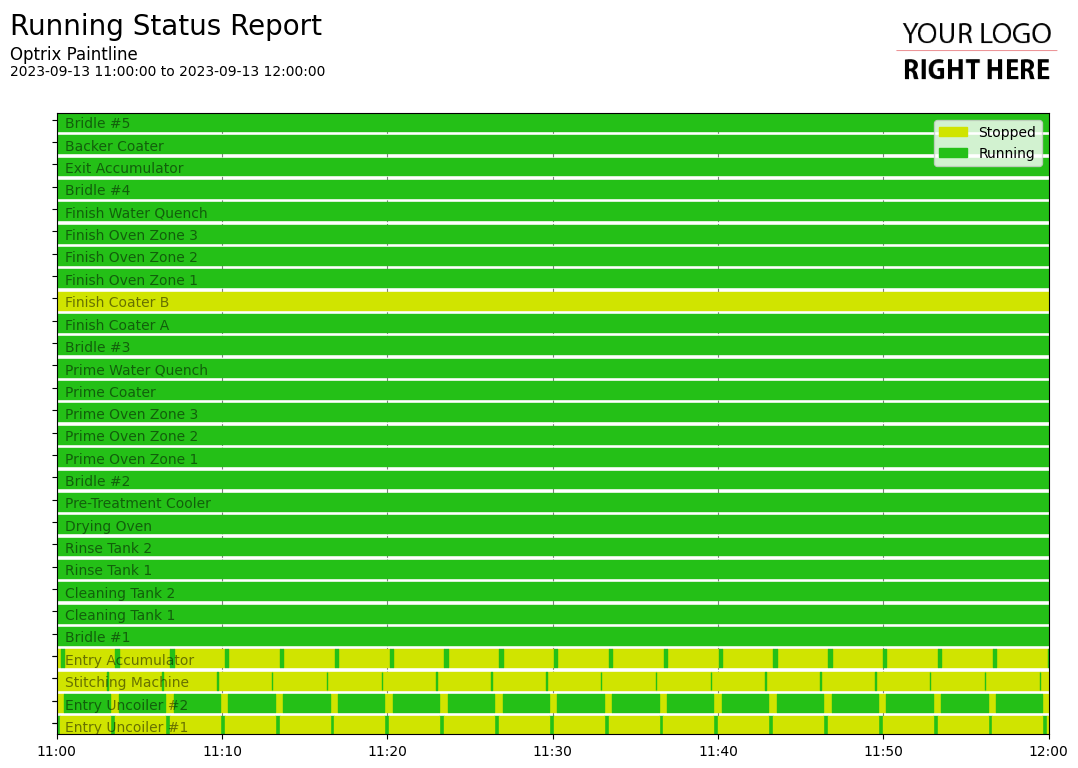
Horizontal bar charts are ideal for showing discrete values, such as if systems are on or off, or what mode your machines are in.
Showing these values as position rarely makes sense to the reader, so colour is usually the easiest way to help people understand what they are seeing.
Example
This example shows a number of machines over time. When the line is green, the machines are running. When the line is yellow, the machine is offline.
Using the chart, you can easily see when any outages occurred, or spot any patterns in operations and faults. However, if you’re interested in knowing how much of the time it spent on vs off, you can use the same data sorted differently to create a summary report.
You can find this example on our paint line demo site.
Tips and Tricks
- These charts are ideal for short time-frames. When used over longer times, it can become difficult (or impossible) to see specific events, which is where the discrete area report is often useful.
See Others
Bar visualisationsDiscrete visualisations
Horizontal visualisations
Report visualisations