Overall
Sometimes you want to use a stock-standard visualisation. Sometimes you want to get a little creative.
With ARDIs reporting engine, your imagination is the limit. As well as being able to build a visualisation from the ground up to be unique, you can also combine multiple different types of visualisation. Not just on the same page, but in the same set of axes.
Example
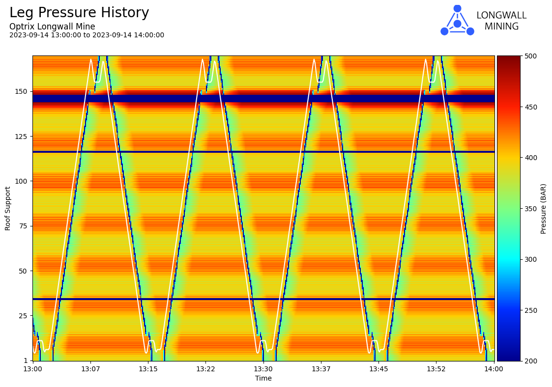
Underneath, this report shows a pressure heatmap, showing the pressures of each one of our underground mine roof supports.
But drawn above and perfectly aligned is a line graph that shows the path of our shearer – the machine that cuts the coal by running up and down the supports.
It doesn’t end with just that – you could add scatter-points that indicate where the shearer had to stop or slow down, and bars to indicate where the machine mode or the mine crew changed.
You’re free to combine any and all of your drawing tools, or build your own unique types of chart by combining the simple building-blocks at your disposal.
This report can be found in our longwall demo site.
See Others
Heatmap visualisationsLine visualisations
Report visualisations