Overall
A line chart is one of the simplest charts to create, but it’s extremely useful when working with small numbers of measurement channels.
They allow you to see detailed changes in values and are easily understood by most readers.
Example
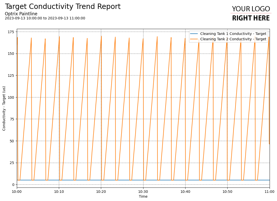
In this example, we are watching a measurement in two of our tanks. One is rock steady, while the other constantly cycles up and then back down again.
You can find this example on our paint line demo site.
Tips and Tricks
- Line charts are ideal when both axes are continuous and one is linear – such as temperature vs time or battery remaining vs distance. If one of your axes are discrete (for example, you have a set of assets on one axis), you’re better off using bar graphs.
- Line charts also quickly become difficult to read when you have too many channels of information. Generally, we suggest changing to using a heatmap or surface chart when you have more than five channels of analogue information.
See Others
Line visualisationsReport visualisations