Overall
Unlike a basic control chart, which asks the reader to compare two values over time to see if your process is under control, a normalised control chart instead does that job for you.
When given the control tolerances that you’re aiming for, it can clearly show where control issues have happened and how severe they were. Because the graph hugs the zero-line, it’s much easier to read these charts at small sizes, making them very useful for daily summary reporting.
Some control loss is expected when the target changes, so the report highlights when the target changes, in what direction, and by how much. This helps the user to understand where expected control losses should be.
Example
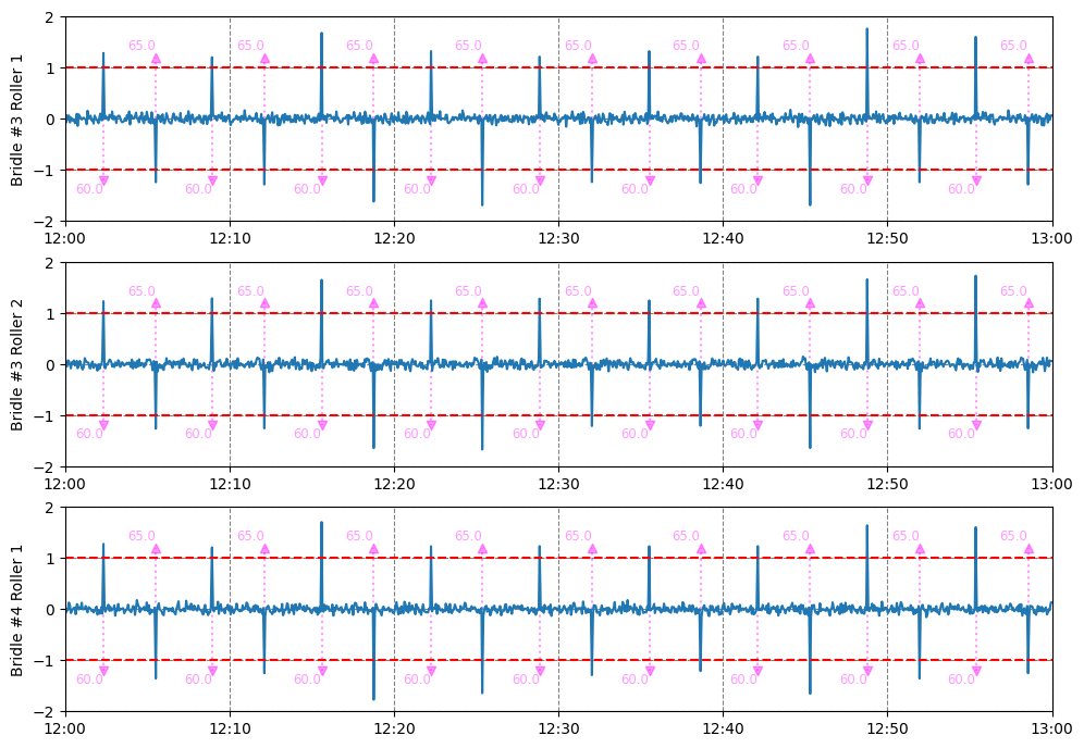
This example is a dynamic report – it displays a line chart for every asset that has both an actual speed, a target speed and a speed control tolerance.
This means that if any new speed-controlled equipment is added to your site, this report will automatically include the new assets.
You can see the control quality is quite good, with the blue (control) line never approaching the red (tolerance) lines, except for immediately after a change in speed (purple indicators).
You can find this example on our paint line demo site.
See Others
Control visualisationsDynamic visualisations
Line visualisations
Report visualisations