Overall
You can use ARDIs knowledge of the relationships and structures between your assets to create diagrams of your connections.
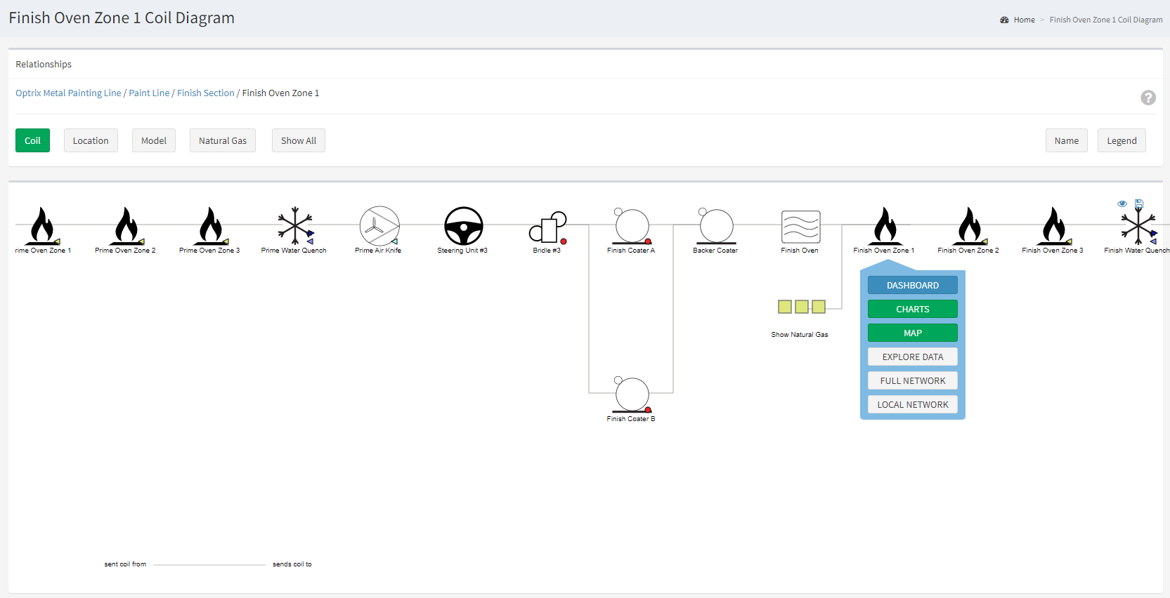
This specific style of diagram focuses on presenting a single relationships for a single asset, and is one of the main displays used when browsing and administering ARDI.
Example
This example shows the Coil relationship on our paint-line. This relationship represents the path the product takes from when it enters the painting system, to when it leaves.
These diagrams are created dynamically every time you open them, and for that asset specifically.
Upstream, you’ll only see those assets that are directly connected to this one, and can follow them back all the way to their source (ie. you can follow an air line back the compressor, power to the incomer, a product line to the bins or unloading point etc.).
Downstream, you’ll see all of the assets that are part of, connected to or otherwise related to the asset, and be able to follow the connections down to where the finally end.
A single asset may have many relationships – in this case, there’s also diagrams for the natural gas relationship (where it gets the gas from), location relationship (where it fits with the rest of the system) and
You can find this example on our paint line demo site.
See Others
Directional visualisationsDynamic visualisations
Horizontal visualisations
Interactive visualisations
Network visualisations
Report visualisations