Overall
There are a number of established methods of displaying data, but sometimes you’ll have a question so specific that you can’t find an existing visualisation that fits.
Once you realise that none of the normal tools at your disposal can work, what do you do?
This is where ARDI (and Pythons) flexibility is incredibly useful – you can create a bespoke report that addresses your specific and sometimes unique needs.
Example
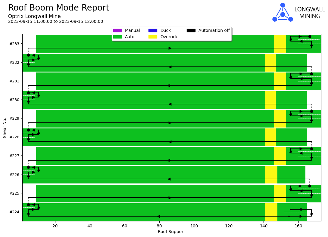
Our Longwall Mine customers often use a heatmap to show what mode their machine was in when it passes a specific point.
Our problem with the report is that the machine will often pass a particular point multiple times, and the report has no way of conveying that information. When asked, people often couldn’t tell us what part of the cutting process was represented on the report.
We’d discussed it with multiple different companies, and although some had come up with their own methods of getting around the issue, none were quite flexible enough to make us satisfied.
So after some inspiration, we developed our own unique visualisation that combines heatmaps, vector plotting, and includes some unique logic that is specific to the application.
It’s extremely niche – the only users we can come up with are longwall mines and automated cranes. Because of this, it’s not something you’d find in your average reporting product. But because we’re working in Python, we can develop our own unique solutions to our own unique problems.
This report can be found in our longwall mine demo.
See Others
Analytic visualisationsDirectional visualisations
Heatmap visualisations
Report visualisations
Summary visualisations