Overall
To check on how well you’re controlling or simulating your process, you can use a simple line graph showing both your target and your actual values.
Where the two lines diverge, you’ve lost control.
Because of the large scales involved, it can be difficult to read these charts when they are packed together in a small space. a normalised control chart might be a better option.
Example
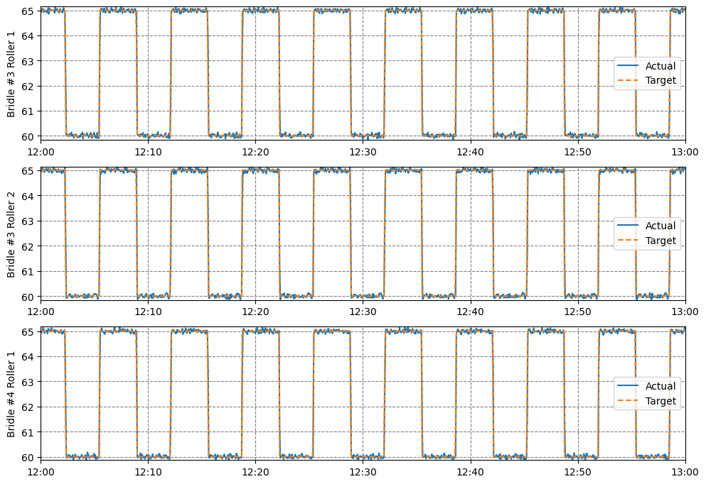
This example is a dynamic report – it displays a line chart for every asset that has both an actual speed and a target speed.
This means that if any new speed-controlled equipment is added to your site, this report will automatically include the new assets.
In this system, speed changes frequently, and the actual speed follows the target speed very closely, except for issues with Bridle #1 and Bridle #5, which sometimes ignore the target speed.
You can find this example on our paint line demo site.
- If you’re really focusing on control quality, a normalised control chart will usually be the better choice.
See Others
Control visualisationsDynamic visualisations
Line visualisations
Report visualisations