Overall
Many production lines have a need for tracking ‘hotspots’ (such as the start of a new item, new batch, new order, or new product type – although we will use the term batch through the rest of this page) through the system.
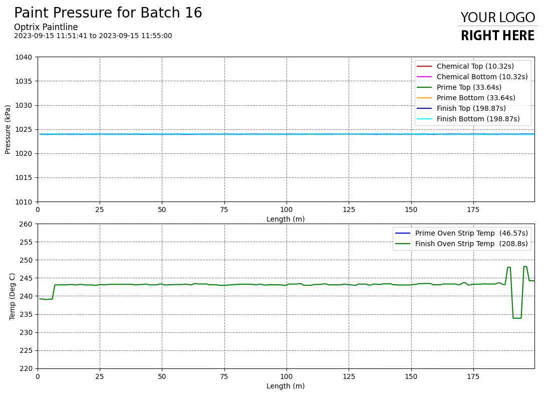
There’s often a requirement to produce a report that includes graphs of key measurements and calculates quality metrics and KPIs about the batch.
However, the batch doesn’t pass through every part of your process simultaneously – to get a proper understanding of the batches travel through your system, you need to synchronise each of the channels of data based on when the batch arrived at each measurement point.
If the first part of the batch is checked for weight at 9:00 at point A, and is checked for temperature at 9:12 at point B, your report needs to display those values so both the weight and the temperature appear together.
Example
One of the most important elements of quality when painting a metal strip on our paint line demo is the roller pressure and temperature. If paint is flowing smoothly, an even pressure is a good indication of even coverage, and hitting the target temperature ensures that the paint adheres properly to the strip.
In this case, we’re reporting by length – each line on the graph is synchronised so that it corresponds to the same piece of the product rather than the same point in time.
This report can be found in our paint-line demo site. Note that because of it needs to generate several batches worth of detailed reports, it takes some time to create.
Tips and Tricks
- Generating this report automatically at the end of each batch (using ARDIs trigger system for example) would give you quick and easy access to reports for specific batches, rather than creating them all at end-of-day.
See Others
Analytic visualisationsHorizontal visualisations
Line visualisations
Report visualisations
Summary visualisations
Timing visualisations